Forsight
A Charity Enhancing the Lives of the Blind and Visually Impaired
It can feel uncomfortable to analyse a charity through the lens of branding. However, for organisations like Forsight, clear and accessible communication is fundamental to engaging both the people they support and those who support them.
Our collaboration began with brand discovery workshops alongside Forsight’s team in Dublin. These sessions provided deep insight into their audiences, services, and lived experiences, allowing accessibility to be embedded as a guiding principle from the outset.
“Accessibility was treated as a guiding principle, not a design consideration.”
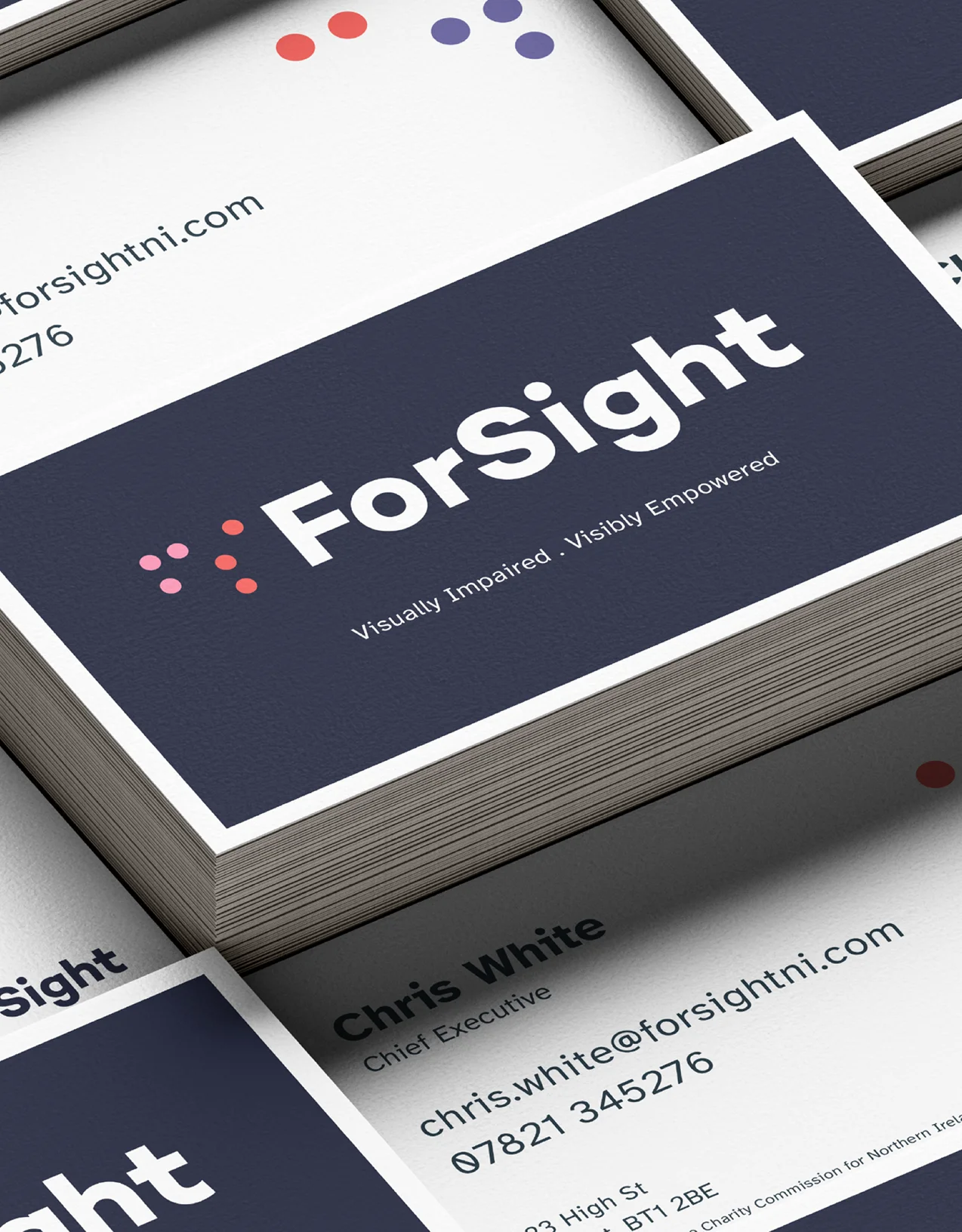
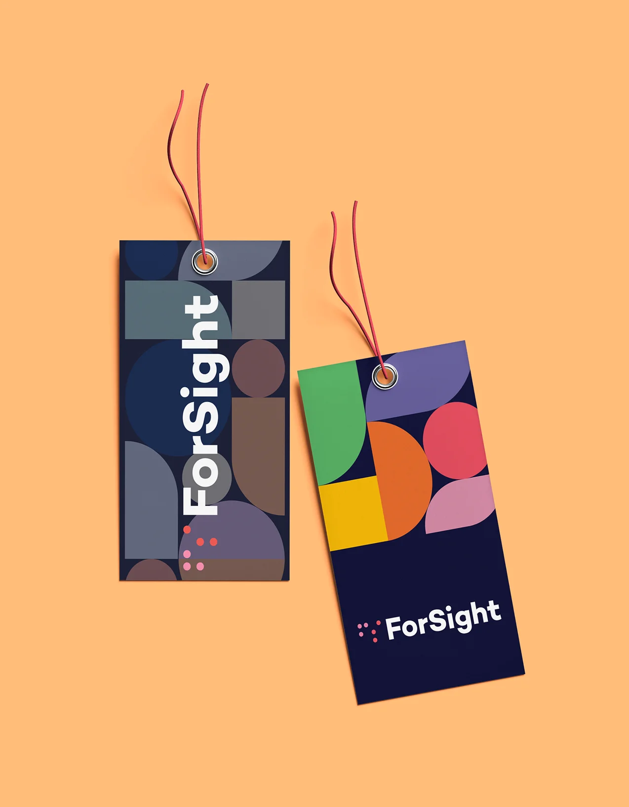
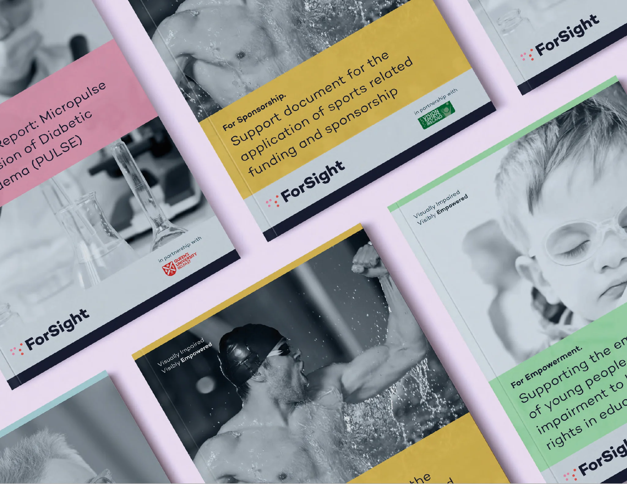
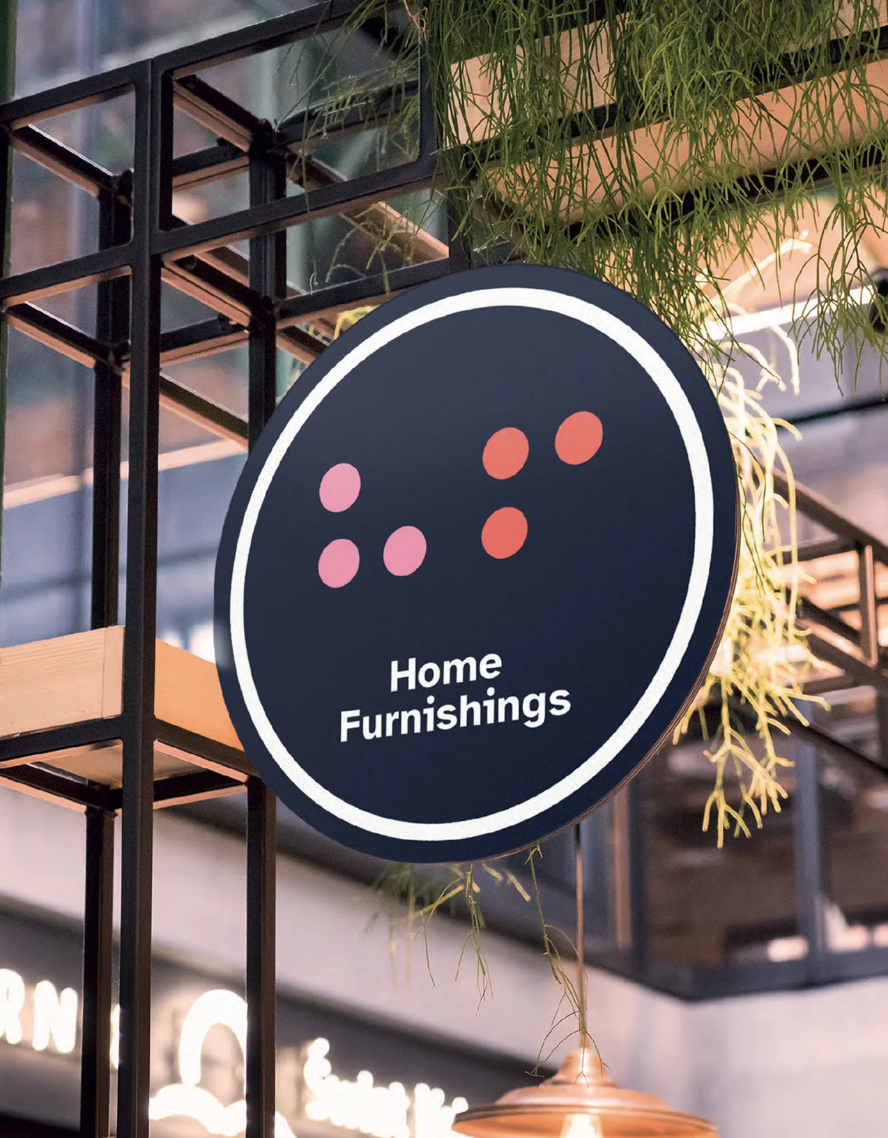
This thinking informed every decision, including the use of the Atkinson Hyperlegible typeface, named after the founder of the Braille Institute and purpose-built to improve legibility for readers with low vision. A carefully considered, high-contrast colour palette and flexible graphics system further support clarity and consistency across all applications.
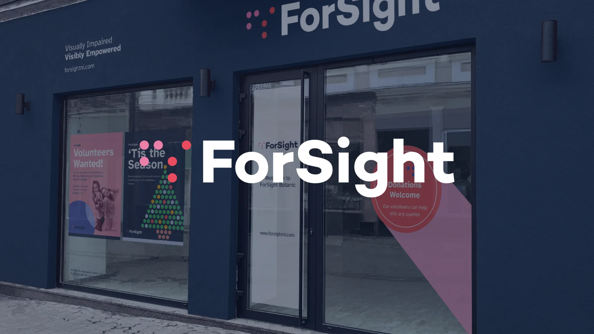
The resulting identity works seamlessly across digital platforms, marketing materials, and retail environments, giving Forsight a confident and cohesive presence. Most importantly, it makes accessibility central to every interaction, strengthening recognition, advocacy, and long-term engagement.
Project Outcomes:
- Branding
- Visual Identity
- Marketing Touchpoints